After I finished my “Canadian companies themed robots” I was struck by inspiration; I like how our government runs for the public good. Now, I’m not uniformly positive; every government since Mulrouney’s has bought into neoliberalism and starved our excellent and vital public services, parroted horseshit about “market solutions” and sold our public utilities to private corporations that squeeze our citizens- and even at our best Canada sits on unceded territory stolen from the peoples whose land this is, with treaties signed in the blood of children and even then not held to by the colonial European powers. I believe that Every Child Matters and I’m a supporter of the Land Back movement and I’d rather have every indigenous person in Canada as my landlord instead of a bank. I push for non-European representation in my models when I can manage it. I don’t think Canada is a perfect nation by any stretch.
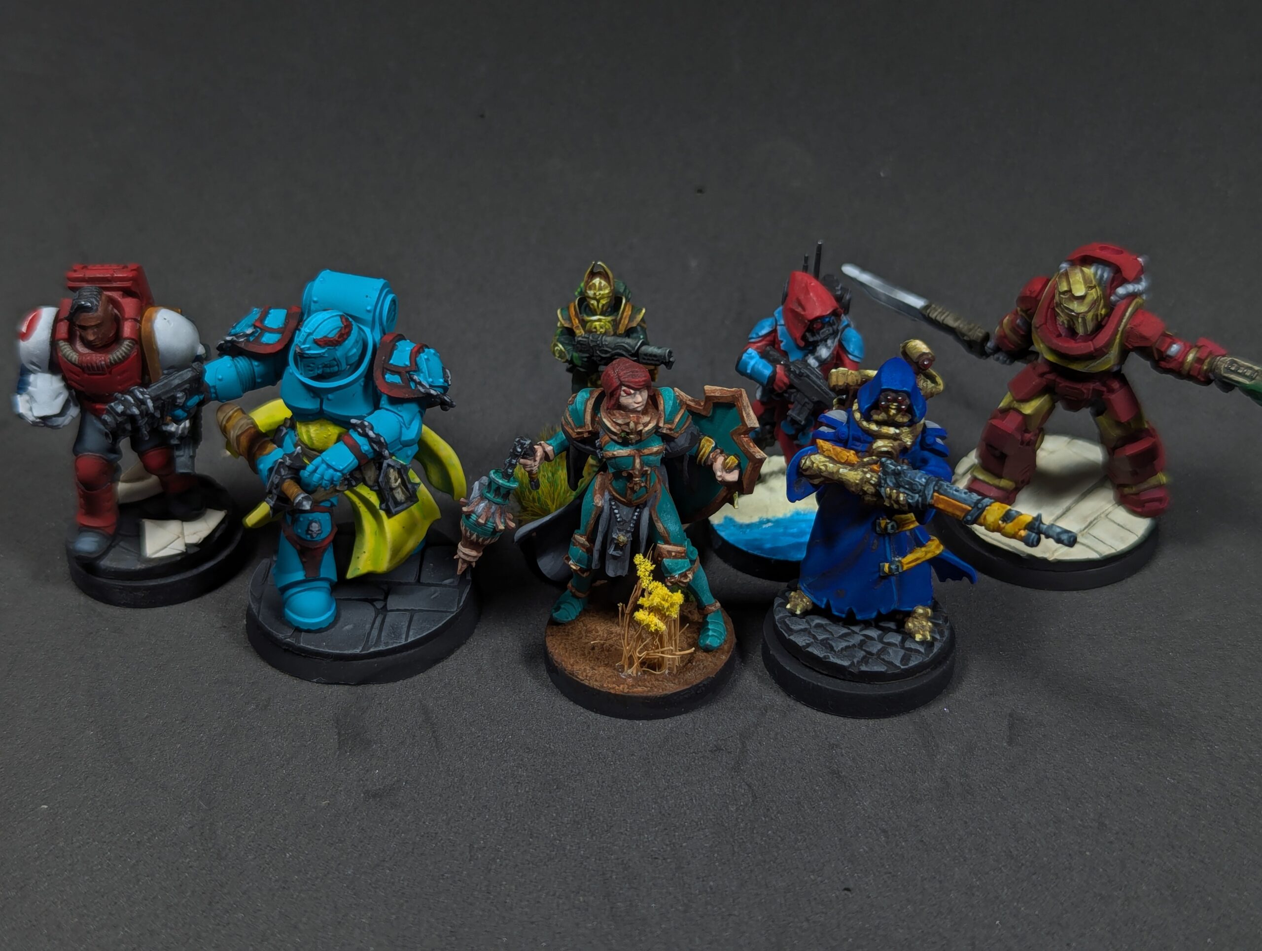
However, I do think we should celebrate it when we get things right, and the way I choose to do it is by painting minis. I let myself spend time on these, trying to make stuff I was proud of, pushing my techniques where I could, and not sticking with “safe” work but trying to take advantage of the strength of skills I’ve developed. Basing was the one area I tried a bunch of new things, and it really paid off both for the model and for the growth of my skills.
Here’s Parks Canada, which maintains our beautiful national park system, painted on DakkaDakka’s Silver Moon Daughter. Really starting to dial in my NMM gold, but there’s still room for improvement.
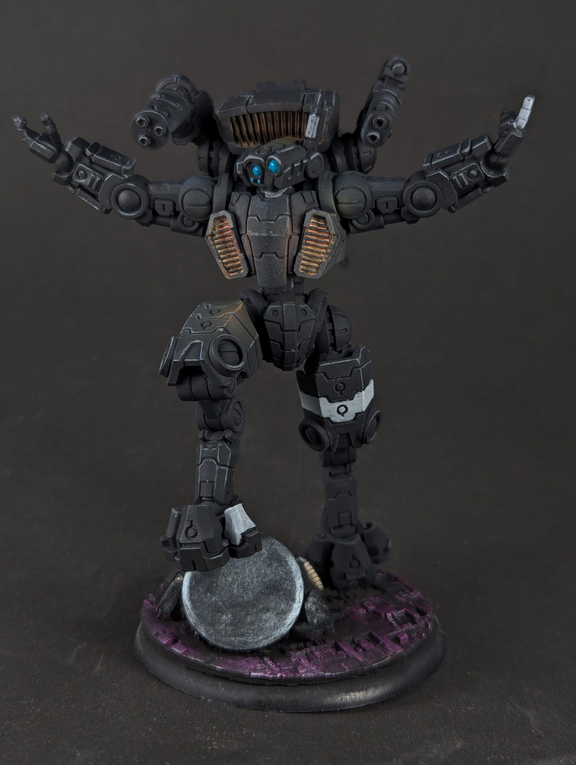
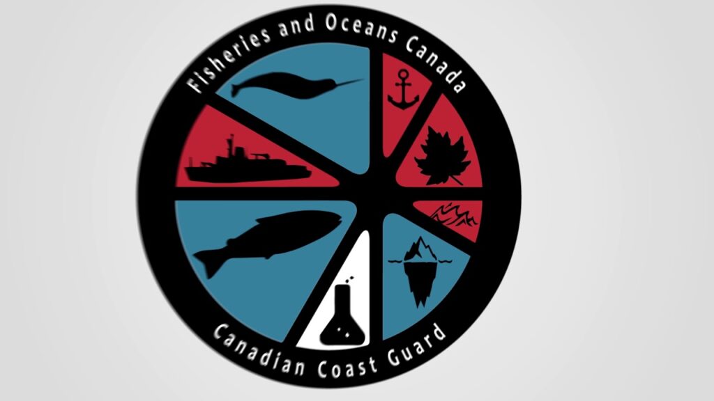
Fisheries and Oceans Canada, and the Canadian Coast Guard, have an infrequently used combination logo that served as my inspiration for the Scavenger Ranger from StationForge (but I accidentally swapped the arms/gun with their Vaskar Infantry). Managed adequate contrast, not quite as grey a blue as I’d hoped for, but this might be the first time I really tried glazing shadows and it worked dandy for contrast.
Canadian Human Rights Commission on DakkaDakka’s Battle Brother. I might be the most proud of how this one came out, excepting the sword. My pattern was super fun, I got some cool painted textures, and I maxed out what I’m calling my Level One airbrush OSL. No edge highlights or source brightness, but a pretty convincing inverse square law lighting job. Good shadows and highlights, though I still don’t have good directionality of light. Still, to get better than this I need to actually adopt new techniques, so it’s something of a watershed.

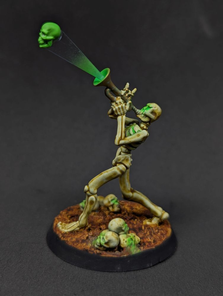
Canadian Grain Commission’s very specific logo for HACCP training for the grain handling industry- those old square wood silos you see in every small prairie town, and the new concrete round silos you see along the main rail line that runs parallel to the #1 Highway for most of the prairies. The model is Bite the Bullet’s Diana the War Sister Purifier, whose censer I managed to snap off no less than three times. The base has my best attempt at the canola and durum wheat that are our major crops.

Canada Post is currently under threat because of neolib “run it like a business” horseshit and the government’s let executives get away with absolutely hosing the mail carriers for years. I hope we get some improvements but I’m not super confident. The freehand logo on the shoulder took effort to get right, but came out okay in the end. Had fun with envelopes on the base.
Libraries and Archives Canada gave me a wide range of colours and I tried to maintain the same balance, using more glazed shadows that really only show when you get up next to it. I really like this model and how it came out, especially that blue, but it didn’t quite get the contrast on the armour I needed.

Canadian Nuclear Safety Commission keeps us from blowing up. I picked them because they had a colourful logo, and the US firing all their equivalent staffers made this model more fun to paint. The brass on the back was a chore and I didn’t quite get the NMM effect I was working toward- but the front looks pretty great!
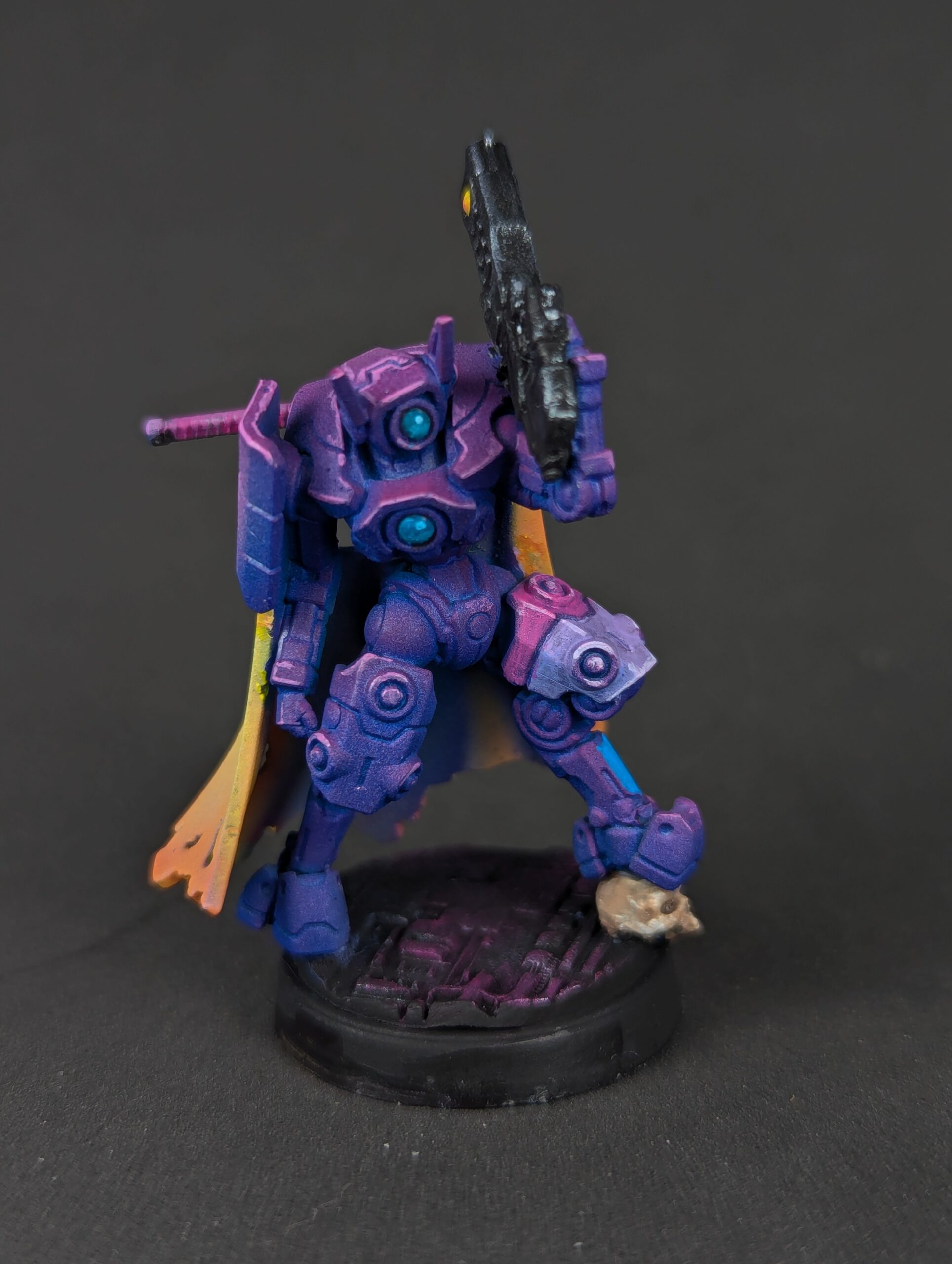
The Supreme Court of Canada was the last model of the project. I was tempted to try and checkerboard the armour like the SCC’s logo but I decided I’d rather enjoy myself and just tried roughly the same ratio of whites, reds, and golds. You can’t tell in the photos that I kinda screwed the light angle on the helmet, but aside from that I’m very proud of it and feeling increasingly confident in my NMM.